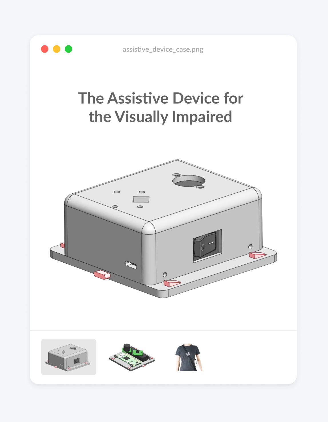
The Assistive Device for the Visually Impaired
January - April 2020

Overview
About: This case study outlines how I was able to implement elements of UX Design in my traditional engineering design project and the impact it had on our final product.
Timeline: January - April 2020
Team: Kaylee Jung, Niko Andrianos, Mika Nogami, Abdullah Raja, Han Yu
Award: Faculty Award in IGEN for the UBC APSC Design and Innovation Day event
Role: Software Engineering and UX Researcher
- I introduced the value of the UX design process, even within a traditional engineering project.
- We spent 550+ minutes interviewing 11 people, 9 of whom were potential users
- The interview data helped us make educated design decisions, leading to a simpler product that solves a real problem.
- The product shifted its focus towards helping its users walk straight while detecting obstacles.
- Our project won the Faculty Award in IGEN for the UBC APSC Design and Innovation Day
Technology: Python, OpenCV, Solidworks, Raspberry Pi
Timeline: September 2019 - April 2020
Problem Statement
As part of my Integrated Engineering degree at the University of British Columbia, I had 4 months to work with a team to design a product that both integrates multiple streams of engineering and makes a social impact. My team initially wanted to build a robot guide dog for the blind, but that idea was a bit ambitious for a 4 month undergraduate project (understatement). We realized, however, that despite the large number of people with visual impairments, the assistive devices available commercially were limited. In fact, most people use white canes or guide dogs for navigation.

It got us thinking:
How might we incorporate technology into a device that combines the best elements of white canes and guide dogs?
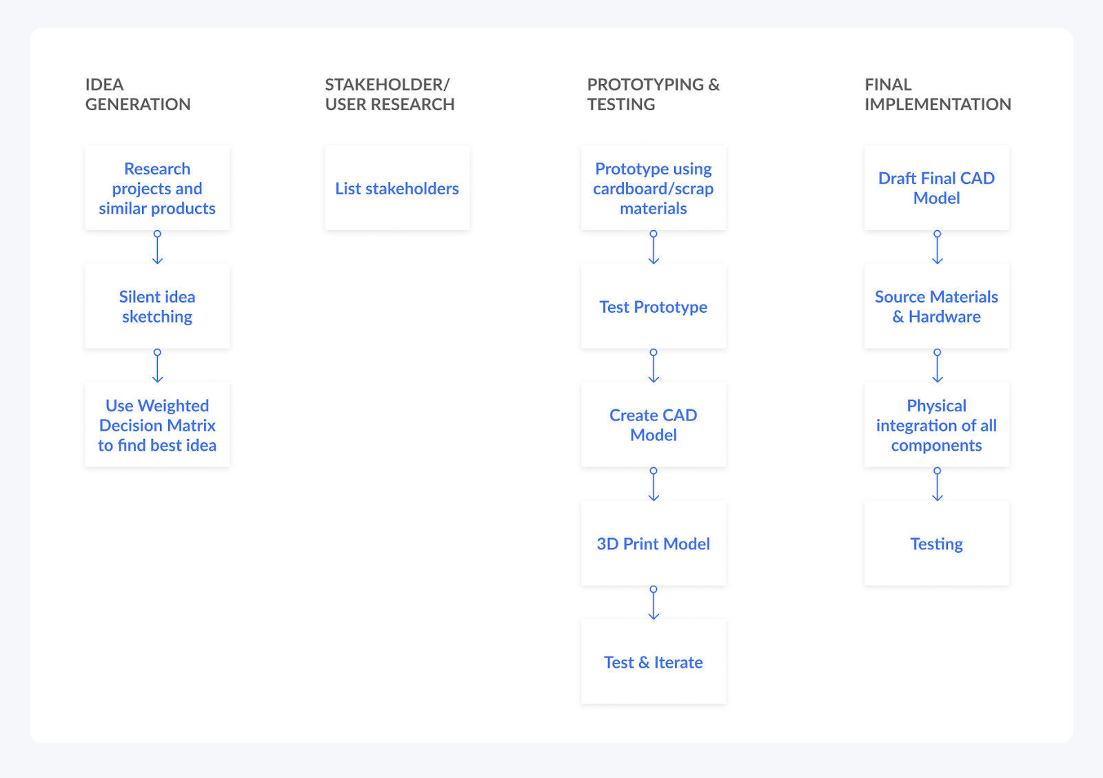
This idea wasn’t going to be easy to tackle; it called for a deeper understanding of our end user than traditional engineering practices could offer: UX Design. This case study highlights how I integrated elements of the UX Design Process into the engineering process, and how that decision made a profound impact on our project.
Introducing UX to Engineers
The first step was to convince my teammates to spend that extra time understanding our user before jumping into engineering. Students become so preoccupied with hardware, material, and software decisions that they’ll skip speaking to their user altogether.
This isn’t to say that engineers don’t care about users, it’s just that the extent to which we delve into their perspectives only gets as far as listing our stakeholders. Without understanding the value of designer-user interactions, students see this step as a task in a checklist rather than a crucial part of engineering a great product.

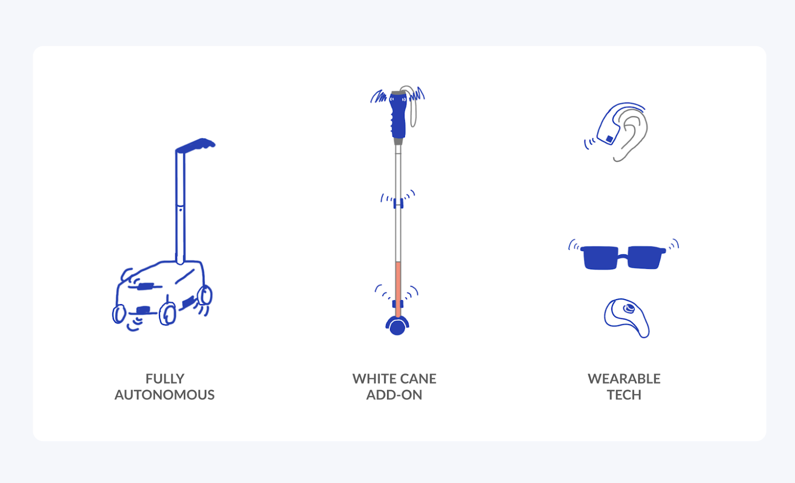
My team fell into this pitfall in the beginning as well, believing that our assumptions would suffice to design our device’s features, until it became increasingly more difficult to make concrete decisions. You can see from our initial sketches that we lacked a sense of direction; any design was as good as another without the research to orient ourselves.

This is when I proposed that we should conduct user interviews. I overcame my team’s initial hesitation by setting up and leading a phone interview with a potential user. This hour long phone conversation humanized the previously abstract concept of an “end user” and uncovered real problems that we could look into solving with our device. I had successfully convinced my team, and by the end we had spent:
550+ minutes interviewing 11 people, 9 of whom were potential users.
What We Discovered
- High unemployment rates for people with visual impairments means that fancy, expensive gadgets are outside their budget
- Walking perfectly straight is extremely difficult--- even deviating slightly can cause someone to walk onto the open road.
- Moving, but quiet objects such as electric cars are difficult to detect, along with objects that are raised above ground
- Devices with too many features are more distracting than they are handy
- Audio instructions are preferred (use of one earphone, Airpods Transparency mode to hear their surrounding environment)
What became most apparent was that people want reassurance in their own instincts, delivered to them in a simple way. The white cane, for example, is a lightweight extension of the user’s arm that enhances their range of detection. The ideal device should thus learn from the white cane and center its user with the added reassurance of their innate abilities.
How Our Product Changed
The feedback we received from user interviews completely changed our perception of the issues that come with visual impairments. We were finally able to make educated design decisions while simultaneously cutting out inaccurate assumptions.
.png)
You can see that the revised MVP is not only more feasible in the 4 month time frame, but provides value by fixing a specific problem rather than offering multiple features to try to appeal to more people. We would have never gotten to this point without speaking to potential users. Introducing UX to engineering gave my team the confidence to move forward with a design that is properly targeted to the end user while saving us time and money in the long run.
Detection Implementation
Walking Straight: Sidewalk detection with OpenCV
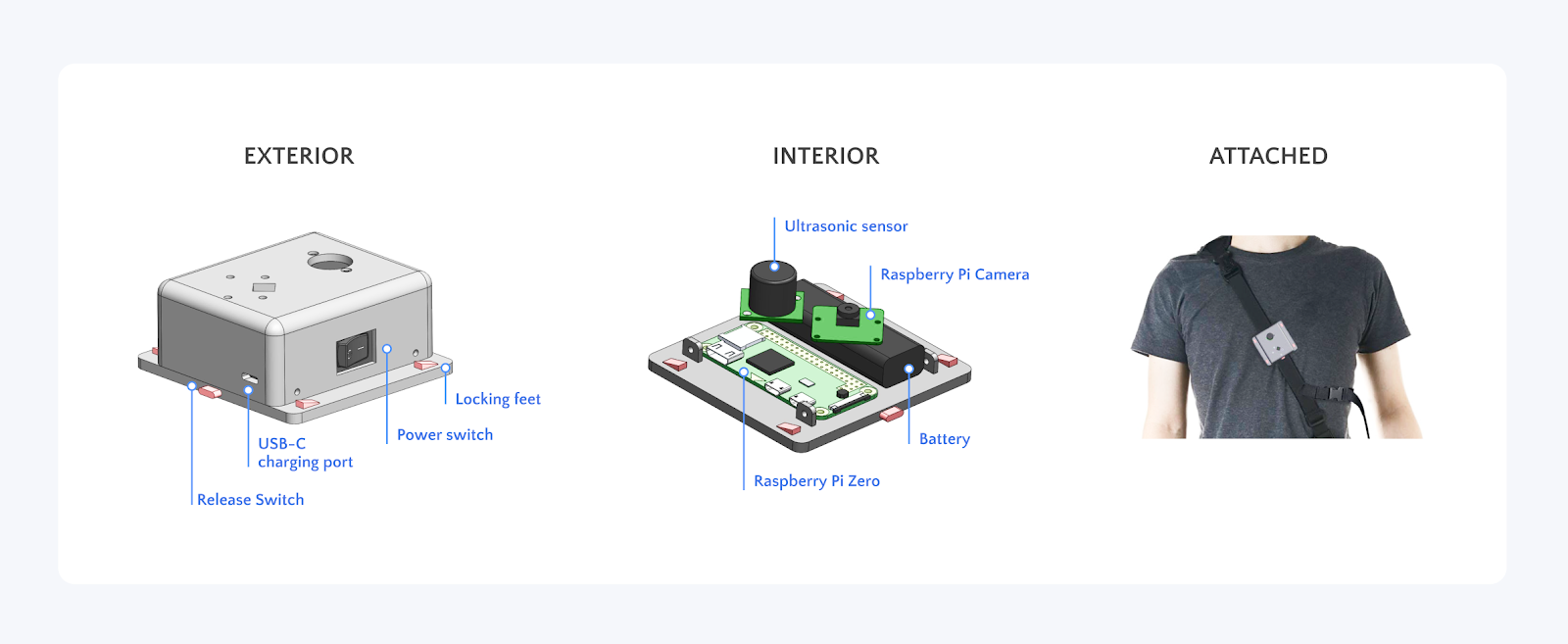
We decided to help users detect their alignment with sidewalks as opposed to other types of walkways for their proximity to open traffic. A lot of sidewalks aren’t elevated from the main road, and can’t be detected with a white cane. The elements that distinguish a sidewalk from a road are primarily visual (colour, texture), so we decided to take advantage of OpenCV’s computer vision library to do the work for our user. Paired with a Raspberry Pi + Pi Camera, we can detect the user’s deviation from the sidewalk’s vanishing point relative to the center.

Obstacle Detection
We used two ultrasonic sensors and the option for the user to toggle between a 4 metre detection range or 2m detection range. This provides flexibility depending on the type of environments: indoor vs outdoor, crowded vs empty.
Final Design

I have purposefully redacted the engineering details involved in making this project come together, but if you're interested in hearing about our implementation process, we were required to create a 10 minute video highlighting it that I've included below!
Limitations
While these interviews were invaluable, we recognized our data’s limitations. Our interviewees were coincidentally all middle-aged men. We also found them via organizations for the blind, which characterizes them as more proactive and potentially more comfortable with less guidance from accessibility tools. From their names and english fluency, we can also determine that they grew up in a Western environment. It would be valuable to speak to potential users of different ages, genders, and ethnicities in the future.
Conclusion
While including the user as part of the process comes naturally to us UX Designers, it’s considered a bonus step in the traditional engineering process that we’re taught in class. It was difficult not to compare ourselves to other teams who had already ordered their hardware, while we delved deep into something that wasn’t “required”. However, the benefit was apparent in that we were able to make decisions based on data and delivered a design that we knew would be useful to our users. Due to COVID-19, we weren’t able to 3D print our parts and put everything together, but our team plans on continuing with this project in September 2020 to refine it further.
An added bonus was that we won the Faculty Award in IGEN for the UBC APSC Design and Innovation Day event, and I’m sure that the extra care we took to listen to our users contributed to this win!